Many of you know that I have been redesigning this website [and rebuilding under the hood].
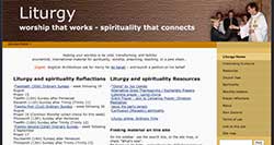
This website began Maundy Thursday 2006 – originally as a place to make my book Celebrating Eucharist available free digitally. You can look at the different ways this website looked throughout its history on the WayBack Machine [If you haven’t found that backup of the internet yet, have fun looking back at other websites as well]. This site, by September 2006 (image above), alongside Celebrating Eucharist, already had many of the components you are used to: reflections on collects, news, opinions, humour,…
What do you think of the current design?
- The fonts?
- The size of the fonts (the shade of the fonts)?
- The colour of the background (white)?
- The colour scheme (blue & green)?
- Varying the background colours corresponding to the liturgical year has gone, as has the header image.
Thanks for the feedback so far. As I redesigned I asked for suggestions and reflections. With one exception people like the new font and the white background – one person found it harder to read. Most wanted the tagline to stay as it is. People liked the colour scheme. Thanks for the feedback, and looking forward to more.
There are further design features to come. These include:
- Better integration with the facebook page
- The right hand side of the home page will have more material
- Drop down menus will go
- “Similar posts” may be better presented
- Some more fonts need to be brought into line
What is not changing: the type, variety, and quality of content. The culture of the community that gathers here.
Are there other features you would like?
 The site was originally built using DreamWeaver. I really didn’t know what I was doing. It was all trial-and-error.
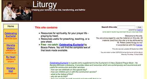
I then purchased RapidWeaver software and took six months to completely rebuild the site. The image on the left shows what the site looked like in August 2007.
Later, I started to appreciate WordPress as a blogging platform, and for some time ran the site on two platforms simultaneously: WordPress for blogging, RapidWeaver for static pages – with a pretty seamless move between the two.
Finally I decided to move everything over to WordPress as the platform for everything. I purchased Headway (a drag-and-drop WordPress theme). Some pages are still in the RapidWeaver format, but with the new look you are seeing, that will need to end.
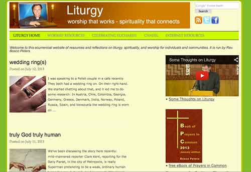
Finally, a reminder what the site looked like before the recent new look:


Hi Bosco. Since you asked…everything else looks great, but I don’t think the font of the header and the titles of the recent posts actually goes with the sleeker feel of the rest of the page. It looked fine on the yellowish more “medieval look” background, but not so good on the fresher, more modern feel of the white, green and blue. Seems like a clash of styles to me 🙂
Thanks for the feedback, Julianne. Much appreciated as you are regular here, you are in a good position. Both fonts are actually new here. I am in no way an expert on fonts (of the non-liturgical kind 😉 ) but this has been the advice I have received from those who are – that the fonts need to contrast/complement. So I will currently go with their advice. I wonder if the font of the actual post is possibly 1 size too small – but all but one seem cool with it. I possibly need to check it against popular sites like Wikipedia. Blessings.
I do find the new font more difficult to read. I’m not sure whether it is actually a smaller font or just gives that impression.
Thanks, Robert. I appreciate the feedback very much. Especially as a regular here. After a week or so I may end up making it larger by a click or so. I will investigate further. Blessings.
I do miss the picture of you popping out of the computer!
I do too, Tracy. It may yet return on a special page of its own 🙂 Blessings.
I like the fresh cleaner look. It seems less cluttered too.
I think I agree that the main post font could do with going up a size.
Thanks, Claudia. As a regular here, I very much appreciate your reflection. And after a week or so will see if a larger font is what is called for. Blessings.
The brighter look is definitely more contemporvant! The pale blue/green scheme reminds me of some major brand… I just can’t think which one.
I will confess, though, that I have been finding the site much harder to read. The body text somehow looks very faint and I have to strain with my eyes a little. Perhaps it’s just my work monitor, but a point size up would probably help.
Thanks, Jesse. I really appreciate the feedback. I have, this morning, increased the fontsize of the post by 1. The comments are temporarily still at the previous size (for comparison). Is this better? Good enough? Need to be larger still? I wonder if the spacing between the lines now might (need to) be reduced a little?
Since choosing the blue/green I have seen this everywhere! Latest being a book of knitting patterns 🙂
Blessings.
I didn’t know you knitted, Bosco! You should do a craft post sometime. 😉
I dyed and wove my own stoles – that took 2 years, Claudia. And I sewed my chasubles. I might just take you up on the craft post. Blessings.
A great improvement! I’m still getting some wonky renderings. For instance the vertical element of the lower-case letter “f” is always blurry and grey instead of crisp and black. Is that just endemic to the font, I wonder?
And by coincidence, here’s another green-blue sighting. Not sure if this is an omen…
http://books.google.ca/books?id=G9P3Yx0eq4EC&printsec=frontcover#v=onepage&q&f=false
I actually looked at that shade as an option & then opted for what I think is a more cheerful tone 🙂
I will look into that, thanks.
Definitely prefer the bigger font size. Somehow the combination of large article and smaller comments seems to work although I can thoroughly understand that this can cause eye strain for some of your many readers. Thanks for letting us be part of your ‘new creation’ 🙂
Thanks for letting me know, Jason. Much appreciated. I suspect that I will settle on having the comments as readable as the post – but I’m not doing (/able to do) this in a rush. Blessings.
The font is much sharper, but I think the vast spaces of white need something to relieve them. Perhaps a cream background would be better or some sort of borders/dividing lines?
Yes, Robert. I also think that the lines now may need to be brought closer together. Thanks, muchly, for the help.
Looking at your Extraordinariate post, and particularly the comments section, I found my eyes took time to adjust between the body of the post and the comments, and longer comments are something of a strain to read now.
Thanks, Robert. So are you saying the posts are good – but the comments’ font now need to be brought to similar size? Blessings.
Yes. I think the current set up is OK for the lighter posts with shorter comments, but the more discursive and closely argued comments to serious posts need a larger font.