UPDATED 9 APRIL – please scroll down for update
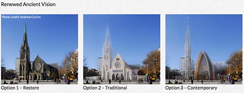
On Thursday, April 4, three options were unveiled for the quake-damaged cathedral in the centre of Christchurch. These are termed 1) Restore; 2) Traditional; 3) Contemporary. They are the result of conversations and an international Study Tour.
While the look of the three is different, essentially only one liturgical option is being offered.
More than a year ago, it was said of option 1, bringing the whole thing down and putting the whole thing up again, that “No-one wants that.” It is a sign of humble listening that that option is now on the table for discussion. [Currently in the online Press poll it is running at about 30%]
Option 2 has echoes of a wooden option Sir Miles Warren unveiled in March. Sir Miles’ building is estimated at $18million (excluding deconstruction). The cathedral, of course, had originally been intended to be wood, and Sir Miles took his inspiration from that. Option 2 appears to have taken these ideas in some different directions. And also ended up with different costings.
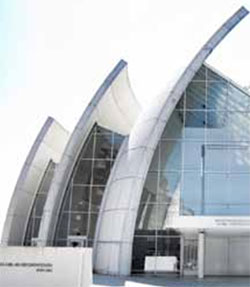
Option 3 is the contemporary designed produced by the committee. The committee gives it as the cheapest, and probably quickest to put up.
Beyond these three options there are some who see the cathedral, as it currently stands, as repairable and able to be appropriately strengthened without the need to deconstruct it. Others think there could have been a wider, possibly international competition, with the committee (with its experience and study) being the judges.
The cathedral, prior to the quakes and as given in Option 1 (restore), is not completed according to the intended original design. The east end is one bay shorter than that early plan, and the east end was so constructed that it could have that extra bay added at a later stage. It is of interest that none of the options picks up on completing the cathedral to what was intended in that original design.
The committee provides us with three floorplans: Option 1; Option 2; Option 3. The committee has only fully developed the plans for Option 3.
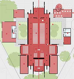
What is of liturgical interest is that each of these floorplans is, at the heart, identical. The committee calls this “renewed ancient vision”. This means, for example, that some in the north transept (or in the south transept) can not see a baptism at the font in any of the three options. The liturgical life celebrated in each of the three options is essentially identical.
The seating is cinema style, with long distances for many in what may encourage more a feeling of observing rather than participating. People can be up to 53 meters away from the font, for example (and, as already noted, around a corner).
From the perspective of planning from the inside out, what is offered is essentially the 19th century plan, with three different “shells” to keep the rain off us. As if to underscore this nineteenth century model, all the images provided by the committee show greying and balding male clergy and all-male leadership.
Only option 1 provides for an adjoining building, which includes toilet facilities. I cannot imagine any contemporary church complex which would intentionally separate its hospitality/fellowship and toilet facilities from its worship space. Inherited separate buildings are a constant issue for worshipping communities. In Option 3 a person inside the church may need to walk about 50 meters (through rain?) to get to a toilet outside.
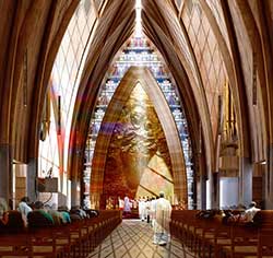
The location of the font is not central, and in Option 2 appears to be separated from the nave by a wall. Are we foreseeing the ignoring of the font on occasions, and the use of an alternative, portable font “up the front”? Anglicans are well known for, in the worship space, collecting altars, fonts, chairs, etc. that are rarely if ever used. This may be understandable in an inherited building but not in a new one.
If baptism is by immersion or submersion, where is the nearest place to dry and change?
What provision is there for projecting onto screens? Many occasions are enhanced by projected images, and some demand them.
What is the children’s chapel? In option 2 it is a building 27 meters long.
Where is the cathedra (the bishop’s chair)? The cathedral takes its role from this feature.
How will this space be used for non-liturgical events? The cathedral in the square was used for lectures, inter-faith events, rented out, the diocesan ball was held in it, concerts,…
How many things, in the committee’s presentation, are placeholders? Has, for example, the 14.5m high bronze image of the Madonna and Child in Option 3, already been commissioned? Or is it (more probably) indicative of what might go on this 16.5m wall? If that is indicative, what else is indicative? Where does indicative stop and set-in-concrete start?
This post is in response to the invitation from the committee requesting feedback. There will be conversation about the cathedral at the diocesan synod meeting this Friday and Saturday (the primary focus of the synod is diocesan strategic planning).
It is my intention to rework the liturgical ideas from this post for that feedback after any conversation that may develop in the comments here. Public consultation concludes on May 3. I am not sure of the process and time frame after that.
I am particularly aware that the heat to light ratio has been rather high on the Christchurch cathedral’s fate. If you want to add heat – there are plenty of other places that welcome your comments; but not here. No anonymous comments, and the usual customs that apply to this community. But, yes, your reflections are certainly most welcome here – as always. And I encourage you to comment and participate.
I have tried to focus on liturgical points; others, I hope, are making connections to the long-term strategic planning of the diocese, connections to the city and Canterbury, and so forth.
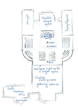
You will have noticed that there are slight variations to the floor plan between options (adding or removing curves, etc). My quick sketch on the left (you can click it to enlarge it) is in response to discussions so far. It is a tweak of the floorplan by adding in two quarter circles, radius approximately 8m.
One enters into a 20-25m square multi-purpose, flexible gathering space with adjoining kitchen and WC facilities. [Note the suggestion that this have two levels]. The division to the main worship space can be opened right up to allow even greater numbers in the worship space for occasions that require it.
For the “wow!” effect as one enters the main worship space, the ceiling in this gathering space could be significantly lower than in that main worship space.
You move past the font into the main worship space. The font is visible from all seats. It is no more than 25m from anyone. Similarly, no person is further than about 14m from the altar.
There is no need for a pulpit. There is a top-quality sound system.
The cathedra, clergy, and leadership seating is with the choir.
The congregation is gathered around Word and Sacrament in a semicircle.
The cruciform sense is remembered. But in current options, few will sit in the transepts. In this configuration, people will flow naturally through the quarter circles into the transepts.
There is a flexible chapel space in the east.
Further update 11 April: the good suggestion worth considering of having the choir more facing the congregation – completing the being in the round effect.
*****
I was specifically asked by the diocesan architects to produce a series on architectural principles. This post is clearly connected to that series. If you wish to read other posts in that series, they are:
The community
The cross
The altar
The font
The ambo/lectern/pulpit
The presider’s chair and the cathedra
The transitional cathedral
Achitectural Design Guidelines 1
Achitectural Design Guidelines 2
Achitectural Design Guidelines 3
Achitectural Design Guidelines 4
eating in church
planning inside out
If you appreciated this post, there are different ways to keep in touch with the community around this website: like the facebook page, follow twitter, use the RSS feed,…



Would you be wiling to share with me the paper describing the elements (community, chair, ambo, altar)? I am working on a doctoral thesis on the relationship between liturgy and architecture. Thanks, Peter
Thanks for your visit and comment, Peter. I am not sure I fully understand what you are asking? The links should go through to those points, and you are welcome to quote them giving the usual source conventions. Is that what you mean? I wonder if you might email me your thesis once you have achieved your doctorate? Or make it otherwise available? Easter Season Blessings.
Excellent post, thank you, Bosco.
I will not comment in response to each question posed! (Valid, worthwhile questions – thank you)
A few thoughts:
(1) I suggest we need to ask at Synod whether the ‘railway carriage’ design re seating is driven by legal considerations (i.e. the trust deed currently disputed before the courts which may imply the footprint of any cathedral we build in the Square needs to be the same) and, if so, whether these legal considerations are going to constrain us in a direction no liturgically-minded architect would go if starting with a truly ‘blank piece of paper.’ All trust deeds can be changed if there is sufficient will …
(2) I think we need a considered and considerable theological reflection on the role of baptism in the life of the church, the application of that reflection to the placement of a font (or, as you point out, fonts plural), noting that a cathedral, among other possibilities for its significance, could be an exemplar in the building of other churches.
(3) The devil lies in the detail in much of church life. At risk of descending to an unbecoming level of banality, I suggest asking the ‘detail’ question of where toilets are best placed in (let alone, outside) a church is, in fact, a fruitful question. Not least because it relates to the crucial question for 21st church architecture: how does a building relate hospitality and worship?
In general terms, I am sure there is a rationale for everything in each design which is debateable and we (who are Anglicans living in the Diocese of Christchurch) need to await the presentation of the rationale before jumping to judgement. But the questions we would like answered by the rationale are worth raising now.
Thanks, Peter, for your very helpful points.
If there is some sort of legal constraint forcing us to retain the 19th century shape, I have missed where we are told that. There are different ways to configure within such a cruciform constraint, but your point of seeking to alter the limitations, should such exist, would seem preferable.
Easter Season Blessings.
Agree with your analysis. Far too, short sighted even in terms of the people uses. Now consider taking it up a notch. Make it a place to celebrate all of creation in the center of the city. Think of incarnating the Benedicite Aotearoa.
I guess that I took two of the possibilities presented as mere proposals and that nothing was permanently decided apart from the restoration, which wouldn’t be a restoration if it wasn’t pretty much a rebuild of what was there before the quake. I find the contemporary design the most exciting. The other two I find staid and boring. And I think the liturgical issues that you mention are rather easily addressed in the contemporary design.
Perhaps soon there will be technology whereby suspended giant screens are relatively invisible until activated with video. So when not in use they are out of sight and out of mind.
I would also hope that Christchurch could learn from Trinity Wall Street’s experience. They have pioneered a new technology in electronic organs because they needed to replace their pipe organ after 9/11 and have saved 10s of millions of dollars replacing what was lost. They are now making the same investment to replace the organ which was lost at St Paul’s Chapel adjacent to Ground Zero.
It is apparent to me that those who have presented these three options have skewed the presentation to favor my choice, it’s the only one that comes out totally in the plus side of the options matrix. The restoration fares the worst.
Thanks, Br David. I think the technology you speak of is already here: glass that is completely transparent, can be made totally opaque, and have images, art, words, whatever, on it as required. I’ll try and find out more – if I do, I might add that here.
Easter Season Blessings.
UPDATE: We have had the technology of electronically making glass transparent or opaque, and I spoke today to Darryn George who used that at Deutsche Bank Head Office, Auckland, NZ, in 2007. We are on the threshold of much more: see here, here, and here. Some of that will be old technology, so last year, by the time the cathedral is up.
My former church in San Francisco had a falling out merely over removing pews and replacing them with chairs. I can only imagine the uproar you are facing in New Zealand. My guess is that the psychology of recovering from a devastating earthquake is what is driving these very conservative options you have before you. If the church had been destroyed by fire, for example, and the rest of the downtown had remained untouched, I’d imagine more imaginative thinking would come to the fore. As someone who lives and worships in New York City, I’ve seen any number of immense cathedral-sized spaces, and none of them seems quite right for the 21st century.
Keeping you all in my thoughts and prayers!
Thanks, Jonathan. Easter Season Blessings.
Option three is probably the inside favourite of the Cathedral Project Group. It has my vote. The public wanted the old building back to look at it from the outside, but the church wanted something more functional for the inside. It is ironic that it delivers the exact opposite. If I was the new Dean I would be concerned about the lack of space for community gatherings and Christian education. Bosco’s point about projection is significant if we want to minister to younger generations. I know that many Anglicans just don’t get this, but now is the time to design in this technology without it looking like an ugly afterthought.
Thanks for your insightful points, Andrew.
“It is ironic that [Option 3] delivers the exact opposite“: many in the non-church-going city and province would like the iconic exterior back (it is our city’s logo); many Christ-centred Mission worshippers would like an interior that helps us to grow forward.
About projection – do look at my comment to Br David.
Easter Season Blessings.
Thanks for raising these questions Bosco. I’ve been taken with the lack of design centred around ‘services for 2012’ (although hopefully we are actually thinking about services for 2112 and beyond. It seems crazy to me that the opportunity to promote the features essential to provide a user-friendly cathedral is being lost.
Imagine a cathedral that could a) be easily heated b) was designed with acoustic projection in mind c) provided the spaces a worshipping community needs!
I hope that there will be plenty more about these features to come in the next few months because how worship can be carried out at the mother-church of the Diocese is of far more interest to me than what it looks like on the outside.
Thanks, Zane. I hope you are checking through the comments above yours also – other’s and mine, which dovetail into what you are saying. We do not have “the next few months”. There is a week between the unveiling of these options and our synod conversation about this (I do not know what form that will take). And a month between this unveiling and the closing of public consultation.
Christ is Risen!
Ironically, though I’m as removed from this as possible, I would have been inclined to something the reverse of Option 3– completely “the same” on the outside, and utterly reworked to reflect the 21th century on the inside. Such would be the “compromise” for the various stakeholders as I might understand it. Alas.
That’s a bit of what the Mormons have done with a couple of their 100+ year old temples. For example the Logan, UT temple was gutted, leaving only the external walls. A brand new seismically modern building was built within and then anchored to the external shell. Historically it looks to be the same 100+ year old building with a more modern complementary reinterpretation coming out one side as an addition, but inside it is as modern as it could be when it was constructed in the 1980s.
http://www.mormontemples.com/files/2010/06/mormon-temple-Logan-Utah1.jpg
Bosco, I was thrilled to see the link to Corning photovoltaic glass. My anxiety about screens in the modern proposal for the new cathedral is eased. These glass screens could be activated when needed for liturgy, words of songs/hymns just from a small tablet. I think they should also look at the new organ arrangement that was put into the church in New York rather than the real thing. I still think the cruciformic style of the body of the nave is so archaic. The lack of a large gathering space for a cuppa after big services and funerals and easily accessible toilets is the greatest challenge.
Blessings
Christine Allan-Johns
Thanks, Christine. I wonder if cruciform can be “present” but not as limiting as this hopscotch version – I sense (with only little modification) an Option 3a with a more semicircular layout, leaving more room at the west end for the gathering space you mention, but not the total loss of the cruciform… Easter Season Blessings.
Bosco, you’re asking the important questions for all of us. The available time for responding to this adequately is pretty short.
I’m glad someone else cares about the font! It’s such an opportunity to create something stunningly beautiful and interesting, and there’s opportunity for it to honour all three tikanga in its design. At the very least, for it to be a very prominent and central design feature, instead of a poky little afterthought.
Nothing much, as you say, about any of these designs has anything to do with Maori and Pasifika, and indeed not a lot to do with where the Pakeha church is these days.
While I’m all for a contemporary design, this one isn’t really cutting it (I’m always a sucker for a giant Madonna though!). It’s still a missed opportunity.
Nothing to do with Maori and Pasifika? I though the entrance was an up-turned waka (canoe) sinking into the ground (liquifaction) to represent the Maori and Earthquake themes. 🙂 Seriously though, “a missed opportunity” is pretty much the best description… although perhaps what we see is just an artist’s impression of one option rather than the exact details that have to be used.
Designing from the inside-out has a lot going for it… I don’t think any of the given options are very practical, and the suggestions on this web page are the best (by far) I have seen. I tried attending the funeral of a local politician in the Cathedral a few years ago but there was not enough space for many people, which is a significant issue (I was standing outside – far from the doors, next to a certain wizard who has strong views on the rebuild!).
I do also wonder how the $18 million rebuild-in-wood of the original George Gilbert Scott design with some modern techniques, that Sir Miles Warren put so much work into, could become the off-putting $85-181 million “re-interpretation” given as Option 2.
Thanks, Mark. Very helpful points. Easter Season Blessings.
That’s wonderful option 1 is on the table! It’s how I’d expect NZ to be- people are listened to!
If it can’t be totally restored maybe something like at Coventry Cathedral could become a monument and part of a contemporary rebuild.
Good luck to all those involved!
Option 3b (b for Bosco!) is worth exploring. The same pointed gothic arch interior of 3a could be maintained. If the large gathering space had a low ceiling then Christian education rooms and some other ancillary functions could be located above it accessed from stairs near the entrance.
Andrew! I am really taken with your idea of having two levels as one comes in: Option 3ba (a for Andrew!) I specifically spoke to the architects about the way that wow-effect works as I describe in the update, and have seen it effectively in NZ. Easter Season Blessings.
Hi Bosco, thanks for sharing your fascinating comments. In my parish in Auckland we have recently read Richard Giles’ book ‘At Heaven’s Gate’ (as a Lent Study) and found it both helpful and provocative in terms of learning and thinking about liturgy and space.
There is a wonderful short clip on Youtube of Giles talking about the elements of the liturgical space in Philadelphia Cathedral – you may have already seen this: http://www.youtube.com/watch?v=wlf8ByjCuUw
All blessings and prayers for the process you are all engaged in.
Thanks for your thoughts and prayers, Clare. And for the clip. Easter Season Blessings.
Greetings Bosco, this is an impressive conversation and very informative for an interested bystander. My personal impressions of the flower-like appearance of Option 3 aside I have two questions or rather reflections on the process. They may have emerged in other discussions. First, in this century I wonder why I can’t see much, if any, influence from Tikanga Maori in the designs. I thought it would have been an excellent opportunity to speak on a visible architectural sense of bi-cultural partnership for the present and future. Second reflection is on the process of consultation. I don’t see the need for the diocese to rush consultation with the likelihood of a 10yr+ building process ahead of them. One month seems like a mistake in the making. I would have thought that presenting these as drafts for a couple of months, with follow up re-drafts over a year or more would be a more sensible approach, especially given the emotive views in the public forums about the Cathedral. I realise you’re not in control of either of those issues, but just raise them as thoughts for you. Prayers for your Synod.
Thanks, Andrew.
Your points are both very helpful. Like you, I have the bicultural and multicultural dimensions in mind. I just limited my post to some basic liturgical notes, and am very happy that others, like you, are expanding on that.
Thank you for reminding people here: I certainly have no particular part in any of this. I am as much an interested observer as others. Like others, I first learnt that this will be a topic for conversation at our synod, meeting a week after the unveiling, like all other interested observers – in the Press.
Easter Season Blessings.
Where do we vote for the new option?
Didn’t I spot a digital poll embedded on your site, Peter? Thanks for the encouragement. Easter Season Blessings.
Why not leave the space empty inside, with all the furnishings moveable or portable?
Why not incorporate a baptistery or at least place for a tank? In churches I know, even if there is an old stone font, it is rarely used as baptisms are held in the main services ‘at the front’, instead of the old tradition of ‘private’ services in the afternoon.
York Minster has been used for Alpha supper evenings, because they could move all the seats and bring in tables.
Thanks, James. I think you will appreciate today’s post. Easter Season Blessings.
Bosco, are you envisioning that the font in your update is just the typical small sprinkling bowl or is this possibly the newer conceived art piece that is a small font spilling/cascading into an adult size submission pool?
Why would the choir not face the congregation, as a more sitting in the round effect?
Great questions for clarification, thanks, Br David.
I would never dream, if I were part of designing any contemporary church building, of having a “small sprinkling bowl” as a font. As I wrote in my post on the font: “New fonts will always have the possibility of immersion as well as pouring.”
Your point about the choir is a further very helpful possible improvement. I will add it into the text(s). Thanks.
Easter Season Blessings.
Thanks for this, Bosco. The Philadelphia Episcopal Cathedral looks like quite a small congregation (70-100?) and they have only one Sunday service, so it’s probably comparable to most Tec parishes. Most of the building looks empty most of the time, so seating people closer together is obvious sense. The actual changes (no projection facilities? no baptistery tank?) are pretty conservative compared to projects I’ve seen or been involved in, where removeable seating in the semi-round and projection and sound systems for amplified music were all installed. The flexibility is an immense blessing, even if moving chairs can be a bore.
How many Sunday services are anticipated for ChristChurch Cathedral and what attendance is expected?
I am hoping, James, that you saw my post today about this, where I stressed that we not clone one solution to another context, but rather seek principles that can be applied. Pre-quakes figures indicate about a thousand worshiping at the cathedral in total a week, say with two Sunday morning Eucharists and an Evensong, and weekday Eucharists and Evensongs. Large services could have extra seating brought in for a total of around a thousand. Normal capacity could hold say around seven hundred. All pretty much off the top of my head from memory – and happy to be corrected. The seating was flexible. The space – less so. Thanks for your participation in this conversation. Christ is Risen.
Thanks, Bosco. I suppose the immediate question is: what are the seating needs for the principal Sunday service? Is this c. 200? Seems pointless installing 700 seats when most of these are empty most of the time. Flexible space and a good stacking system should fit into any plans.