I recently posted some thoughts about the church’s digital presence online; I gave an invitation and randomly picked one church website where honest and constructive feedback on a church website was asked for: “What do you like, and where and how can we improve it?”
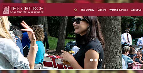
The website is that of The Church of St Michael & St George (St Louis, Missouri, USA).
The site loads relatively quickly (4-8 seconds, depending where in the world you are). There are plenty of online sites that test speed and give suggestions for improvements. The site is clear on different platforms (laptop to mobile). It is well laid out, without clutter, yet everything is easy to find.
The site is attractive to look at. There are three photos that rotate through on the front page (an icon; some children; an outside event).
The linked facebook page is up to date. And when I messaged the church’s facebook page, I received a reply within half an hour – which is very encouraging.
There is a clear map of the church’s location, and this map is relatively easy to find on the site. There are even instructions how to get there. There are good introductions, with photos, to clergy and parish leadership. There is lots of information, if you look for it, about what you might expect if you are a newcomer or visitor. Service times are clear.
There are plenty of ways to get in touch – including a contact form.
Sermons are online.
I wonder if some of the first information that a visitor to the site encounters is rather esoteric church-speak? [“Rite I… Eucharist… homily”]. As a non-church person, what would they make of such language as the first information that they encounter? Could the information about service times be in less churchy language with a click-through link to more information (or that information appearing as you hover)?
Might there be more photos so that people get a picture, an idea more quickly, of what they might come to? What about a short video introduction? Might the map be on the front page? Might the Rector’s welcome be expanded? Might the logo of The Episcopal Church be somewhere – or it be more immediately clear what denomination this is?
The linked Instagram has no content. The linked Twitter, like facebook, is good – but I have not received a reply to a public tweet asking for a response. There could be a YouTube channel.
The church could “claim the business” on its presence on online maps (a process which is free). This also might give a better spread of its online events.
The website of The Church of St Michael & St George is a wonderful example of a church site. Others could use it as a guide for developing their own church site. It is the sort of church that I, and I am sure many others, would be drawn to become part of.
May God bless your lives, ministry, and mission, and thank you for your example to us all – and for the invitation to reflect on your digital presence.