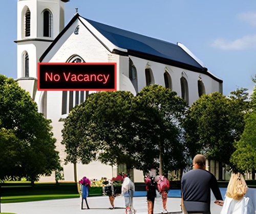
Put to one side the poor quality of 19th-Century promotion – out-of-date, false information on physical signs… [“Yes, normally we have an 8am and a 10am service, but in January – sure the noticeboard doesn’t say this, but everyone knows it – in January, because of the holiday period, after Christmas, there’s only a 9am service.”]
Put to the other side the dreadful lack of that 20th-Century publicity – printed sheets and cards in letter boxes, motels, hotels, and (information centres, café, and supermarket) notice boards….
Let’s focus here, as the (Southern Hemisphere) summer holiday period closes, on the appalling state of (many/most) (Anglican) Christian online presence.
From much of the online presence (and lack thereof), it certainly seems like (many/most?) Anglican communities don’t expect people to go to church when they are away from home on holiday. There seems no strong desire to reach out to visitors, newcomers, seekers…
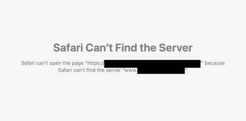
Just one example from one of the most-visited towns in NZ: the digital search for an Anglican church turned up a result, but click on this link at the top of the search result, and this is what you get (to protect the guilty, I’ve blocked out the details):

Other searches, in other places, yes do turn up good quality, helpful results from time to time, but – let’s be honest with ourselves – often they are poor quality, out of date, incorrect, unhelpful, lacking important details, unattractive, not phone-friendly,…
This year, there is a meeting of General Synod Te Hinota Whanui (GSTHW). I have previously said, “If the church could be more autocratic, it could have (had) a website for the whole country, with parishes, schools, and other ministry units forming pages (and sub-pages) within that (those parishes, etc, keeping their own section up to date), all following a similar layout, all assuredly up to date.” Could GSTHW set up a national role of a person overseeing our NZ Anglican web presence (one ministry unit’s web presence a day?)? Could it set up a national website as I describe in my quote at the start of this paragraph? If not now, when? If we can’t find the unity to do this nationally (hey, anglican.nz is not being used! Nor is Anglican.com. Anglican.co.nz has been grabbed by an astute parish), what about at least each diocese and hui amorangi doing this locally? And having oversight of our online mission and ministry as one of the portfolios of a diocesan role?
Continuing to reflect on the lack of energy for visitors and new people that many Anglican communities seem to have, the frog-boiling parable appears to apply: we seem to have grown used to/ accepting of parishes with 30-50 (older) people in the Sunday congregation. We seem to have grown used to/ accepting of a full-stipend priest spending a lot of/ a lot more time producing the Sunday service. Cranmer appears prophetic:
the manifold changings of the Service, was the cause, that to turn the Book only was so hard and intricate a matter, that many times there was more business to find out what should be read, than to read it when it was found out.
Concerning the Service of the Church – Book of Common Prayer
Creative power-point, pew-sheet, sermon, etc, etc, are all generally (increasingly) far more time-and-energy consuming than in the days of opening the Prayer Book (1662, 1928, or 1989!) and hymn book. One might compare – as was regularly done in the past – priestly ministry to teaching; the remuneration package of a stipended priest is not incomparable to a teacher’s (not forgetting a teacher generally begins with a significant student loan to repay). I raise this because, generally, the parish costs are not being supplied solely by the (30-50ish) congregants that I mentioned. Parishes generally seem to have other sources of income than solely the congregation; one (sadly!) wonders: what if the congregants were the sole source of income, might that lead to a more urgent attention to the 21st-century readily available means of online, digital promotion… [Do we need to remind ourselves that parishes had more than 30-50-people congregations; that this – to pick up the teacher parallel – is the number of people a teacher regularly encounters before morning break; and that the dropping numbers isn’t happening (or will continue to happen) in a straight line…?]
When you search for the Anglican Church (or church generally) in any area, Google provides information via what it calls the Google Business Profile – “Google Business Profile is an easy-to-use tool for businesses and organizations to manage their online presence across Google”. If a church has not claimed its own Google Profile that is a MORTAL SIN! It is literally a five-minute process that makes the church information available free, easy to set up, and drives serious traffic to your website etc from Google Search and Google Maps. I have written about the church free Google presence previously. If the diocesan office has not checked that all its ministry units have their Google Profile claimed – that also is a contemporary mortal sin! Quite regularly I see questions on a church Google profile pleading to know the time of (for example) Christmas services, etc. AND THERE SIMPLY IS NO RESPONSE!!! Here were people (locals, visitors, holiday-makers, seekers) wanting to go to church, and no one answered their question of what time the service is!
Energy for different platforms of social media understandably waxes and wanes – but if your parish/ministry unit isn’t regularly updating one of your social-media platforms, please state that in the last post on that particular platform and give direction (url, etc) where they can get up-to-date information. I am delighted that the Cardboard Cathedral where I, as Interim Dean, introduced reels, is continuing with those – reels are amongst the most popular social media. Creating a reel from a recorded service is surprisingly simple – including adding captions.
I advocate that on the first day back after Sunday’s services a half hour or so is spent on updating the church’s online presence (no more should be needed – the software for the website should be very simple to use, eg WordPress): check details for next Sunday are correct (Canva is my free go-to image creator – eg the image at the top), upload reels, update social media, respond to questions and comments on Google Profile, social media, etc. NB – it’s called SOCIAL media.
I would add my own belief that people should find something of value in your church’s online presence – whether they attend your church service or not. In other words: NB it is about out-reach, not solely in-drag! Another way to think about this is that many churches are using their online presence for nothing more than a noticeboard – that’s simply the church doing Web 1.0 in a 3.0 world.
You will need to put some protocols into place: you want a positive, safe environment in the online space(s) around your church. What level of debate will you allow? When would you remove a comment? When would you block someone? [These are not too different from enabling, facilitating a healthy IRL (faith) community – a key is reminding people that there are real people on the other sides of the screen – on this site, for example, it is rare that I allow an anonymous or pseudonymous comment, and only if I know about the person and why they feel the need to preserve anonymity.]
For your church website, I have previously suggested you need:
- Address of where you meet – maybe with a clear map, and where to park if they come by car.
- Time of your service. Maybe a simple calendar, so people can click & look ahead.
- Maybe a simple description of your service – not patronising, but also not using church-speak (“BCP”, “Prayer Book”, “Eucharist”, “Traditional”, “1662”,…)
- Maybe a photo of the building and of the leadership, with names. More importantly: a photo of an ordinary service – giving a sense of the “dress code”, ages, atmosphere… – not just a photo of the full church when the bishop visited 7 years ago…
- Maybe a phone number
- Who is welcome (don’t put “everyone is welcome” and then not have a ramp; or not use any Te Reo; or have readings and hymns in gender-exclusive language; etc).
- Assurance that the front page is up to date; if there’s photos from the last exciting St Francis pet blessing day 7 years ago; and the main information is Christmas service times (yes – that is still the first information in many websites I see, now in May). Sure – deep down in your church website there may be outdated information (a tangled mess from previous years, even), but the front page, for visitors, must be up to date & clearly state: though there is historic information deeper in, this stuff you are reading now will assuredly get you to the correct service in the correct place at the correct time.
- What else does a visitor want/need to know at first glance on your site…
Previously I’ve stressed that your web presence needs to be good on a phone as well as a laptop. I remember when about half of the accessing of this site was from a phone. Now that’s shifted: about three-quarters of accessing of this website is done from a cell phone! How does your church website look on a cell phone? How easy is it to navigate?
If you know of a great church website, please put it as an encouragement in the comments below. Do you have any other helpful suggestions? Do add them in the comments.
Do follow:
The Liturgy Facebook Page
The Liturgy Twitter Profile
The Liturgy Instagram
and/or sign up to a not-too-often email


